

Every really cool font eventually comes out in a “neue” version. The most famous is Helvetica Neue, which was the modernized version of Helvetica, with its normalized weights and corrected curves and very subtle curve changes.
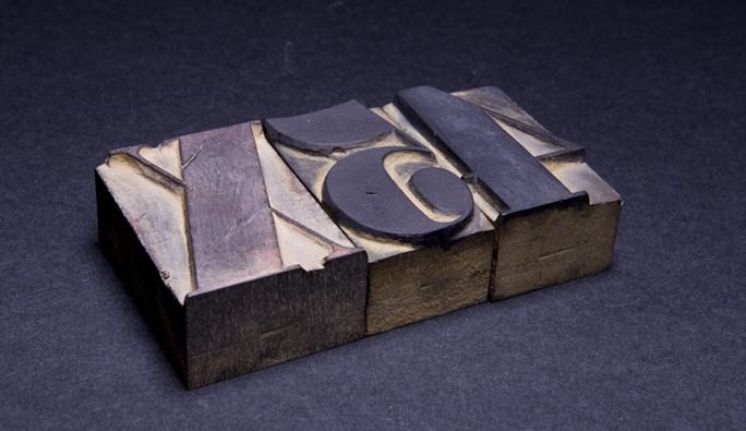
Prince Bold is based on a font of wood type in the collection of the Shakespeare Press Museum at Cal Poly. It was cut in 1832 from blocks of black walnut. It still prints beautifully on the museum’s many letterpresses.
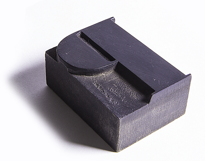
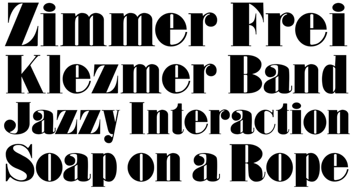
Last year I designed (or more correctly – converted) a type font called Prince Bold. It is based on a font of wood type that is in the collection of the Shakespeare Press Museum at Cal Poly. Interestingly, it turns out to be the oldest item in the collection, having been made in 1832. It was carved mechanically from black walnut by a company in Connecticut, and then sold by a type foundry in New York City. Considering that electric tools were not in use in 1832, it would probably have been carved with steam-powered routing machines. The precision of the carving shows a tremendous degree of sophistication in manufacture. There are incredibly fragile thin line components of the letters, parts that have never broken or failed in the 185 years the type has been in use. The walnut wood used was amazingly hard, and that wood has stood the test of time.
The original wood type is about three inches tall. It appears to have been cut by rotating router cutters, and finished by hand with sandpaper and files.
The original font had the unimaginative name Roman XX Condensed. I renamed it Prince Bold in honor of Raymond J.Prince, who has been so generous to the graphic arts industry, and to Cal Poly, in his philanthropy. Our students made an impressive presentation of Prince Bold to him last year when they all showed up at a dinner wearing bright red T shirts emblazoned with a big Prince Bold P in white on the front.
In the making of the digital font, I first proofed the wood type on our Vandercook proof press, then scanned the proofs and re-drew the letters in Adobe Illustrator. I was faithful to all of the vagaries of the letters in doing this. I wanted the new font to be as accurate as possible. The first version was true to the original, and that version is quite condensed.
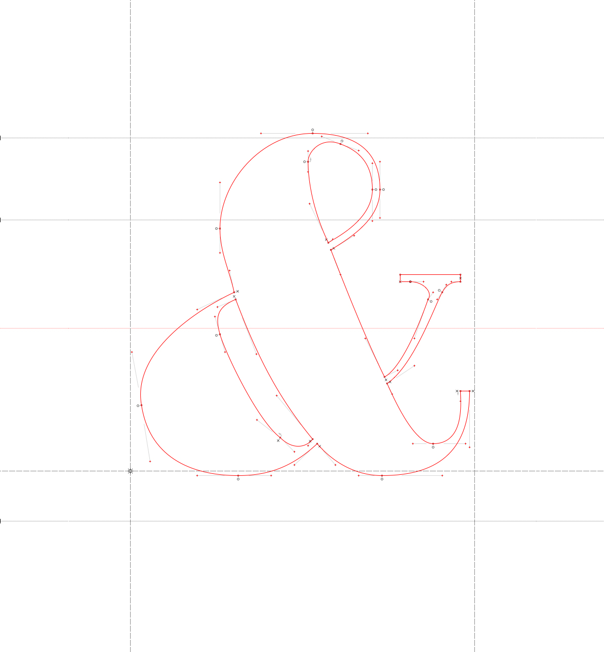
This is the ampersand glyph in FontLab Studio. I try to be a minimalist when drawing letters with vectors. This letter, and all the others have as few anchor points as possible, resulting in smooth curves and gentle variations. Notice that the round parts, top and bottom, exceed the baseline and the X-height lines. This is to overcome an illusion that round letters appear smaller than their counterparts when they are within the boundaries.
When I remade the Roman XX Condensed to Prince Bold, I un-condensed it, using a tool in the font design program FontLab Studio. That was easy: I put a number into a formula and watched as the program widened all of the letters. Then I started the laborious process of correcting the variations in the font. The tiny hardwood serifs were not consistent, the thins were slightly variable, the thicks were mechanically consistent, but visually imperfect. I worked on it for about a month and what came out the other end was a passable font that resembled the original wood type, but looked more modern.
Other small changes included making the round letters larger than their geometric fellows. This, in a digital font, means making the round parts of letters like O and S, and g and p extend beyond the baseline and x-height lines of the design. When done correctly, these letters then look the same size as their geometric counterparts. I also made the punctuation marks larger to match the weight of the font, and I drew a whole list of characters that exist in a regular digital font, but which never existed in the original. These include the accented characters for Romance and Germanic uses, and ligatures, currency symbols, etc.
The test of any type font is its use. I have had a few chances to use Prince Bold in printed projects, and every time I use it I see errors in the design that I want to fix. One recently pushed me over the top, so I went to work on Prince Bold and repaired a number of the letters to make the font look better overall. 
The most glaring problem was an emaciated lower case z (see above), which was drawn from the original wood type exactly, but when used in text just looked wrong. It needed something, but I wasn’t sure what. The lower case s was similarly skinny, looking out of place among its neighbors. The question mark was ugly and didn’t match the other letters, as was the lower case e. And so on.
This is the revised version of the lower case z, and wider lower case e and o.
Jim Parkinson, the famous Oakland type designer, once told me that you never finish a type font. He said, “You declare victory and move on!” He has decades more experience than I do (and he is a much more talented designer than I am). But, after being in the type design world for many years now, I appreciate what he said. Instead of perfecting a font forever, it’s important to finish! I’m sure I’m not finished with Prince Bold, but it is a lot better now than it was at first.
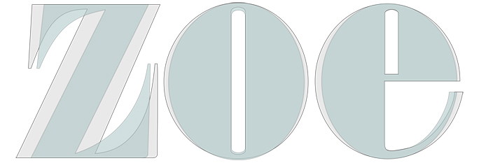
This shows the modifications to the three letters (gray), each wider than the original (light green). The z is most different, making it not only match the other letters better, but making it more stylish.
Will I rename it Neue Prince Bold? I don’t think so. But it has been made neuer than it was, and I am much happier with the design now.
The font will be available for sale soon from the Shakespeare Press Museum at Cal Poly. Proceeds of all sales will buy the students an occasional pizza.