

Each year I create a ticket. It’s a personal project, and in recent years it has become something of a personal challenge.
I recently read a book about security printing. It was simply awful. Bad illustrations, meaningless text, too much information about commercial products, and not enough information about the subject of the book. After I read it, I put it in the recycling bin; it will come to better use there than in my library.
Despite my distaste for that book, I decided to practice some security printing techniques on this year’s ticket – just to see what I could do.
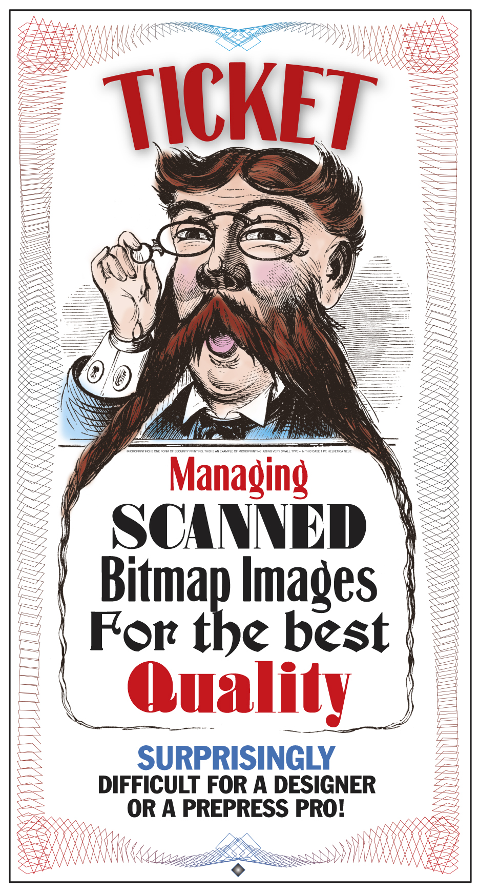
This is roughly what this year’s ticket looks like. It has one of my engravings as the base art, a simple guilloche pattern created in Adobe Illustrator, and type fonts of my own design. Just above the word “Managing” is a line of one-point Helvetica Neue Medium type (which becomes microprinting in the finished ticket). This image is about 2X normal size.
The ticket is a method for giving extra credit to my students for attending presentations during Cal Poly’s International Graphic Communication Week events. During this week we cancel most of our classes, and students attend lectures and presentations by industry experts, graduates of our program, technical innovators, and futurists. All of these fine people tell the students about their part in our industry – and these are some impressive presenters! This year we learned about the success that has been seen by Scodix with their impressive post-press technology for foil stamping, embossing and decorating of printed materials. We also learned how Steven Label Company (Santa Fe Springs, California) makes printed electronics for medical devices and for consumer electronics. We learned about Americhip’s work to put electronics into printed products, and how those electronic additions are making their customers look great in the eyes of their customers. We saw the beautiful books published by Chronicle Books, America’s largest independently owned publisher.
As always, it was an extraordinary week.
The students are required to attend lectures during normal class hours. Outside of those required times, though, I give extra credit for each hour a student participates in our activities. At the end of each presentation the students come up to me, and I hand them a ticket. Later, they write their name on the back and give their collection of tickets back to me. I add them up and assign extra credit points. The total of all the tickets turned in tells me how many total student-hours were earned (It’s over 225 this year).
The tickets create a buzz among the students because they are well-made and they are funny. I am amused that they like them so much.
This year and last I have used very-high resolution images of copper engravings as the art on the ticket. I add some text and I print them on our Konica-Minolta C1100 digital press on a nice satin-finish cover stock. This year I added microprinting. Both last year and this year I have included a guilloche pattern created in Adobe Illustrator to make the tickets look even better.
It would be impossible to photocopy one of my tickets successfully (though I don’t expect anyone to try).
Both years I colorized my engravings to add some personality to the art. That required me to develop a technique for colorizing that does not cause the illustration to be turned into a halftone pattern when printed (See my blog from last week for more on avoiding halftones). The technique allows me to paint with color “on top” of the black-only line art of the engraving.
I learned this technique from a friend who draws an internationally-syndicated cartoon. That gentleman showed me how his line art illustrations are colorized in Adobe Photoshop as a color overlay layer which can be used by newspapers that print in color, and ignored by those papers that print his cartoon in black only. It’s a great technique, and it works well for my engravings.
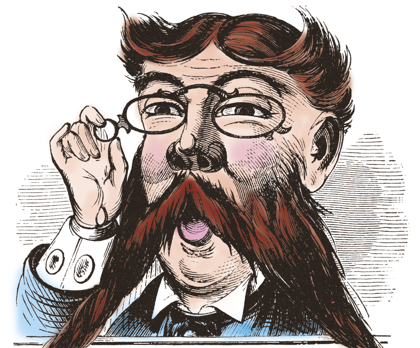
This is a cropped view of the colorized illustration. Click on the image to see it larger.
I start by scanning at 2400 ppi, and I convert to grayscale then to BMP using the 50% Threshold technique (described in my last blog). This results in a one-bit file – strictly black or white. Then I convert the image back to CMYK, which technically changes it from a bitmap image to a tonal image. But – there is no tonality in the image. (I have not had a chance to print this type of image on the Heidelberg press yet; it will be interesting to see if the bitmap remains strictly black and white, or if it turns into a halftone).
From the CMYK image I copy the black information into the clipboard. Then I create a new CMYK document (Photoshop already knows the pixel dimensions). Choosing the Black Channel in the Channels pane, I then paste the black art onto the black channel – only.
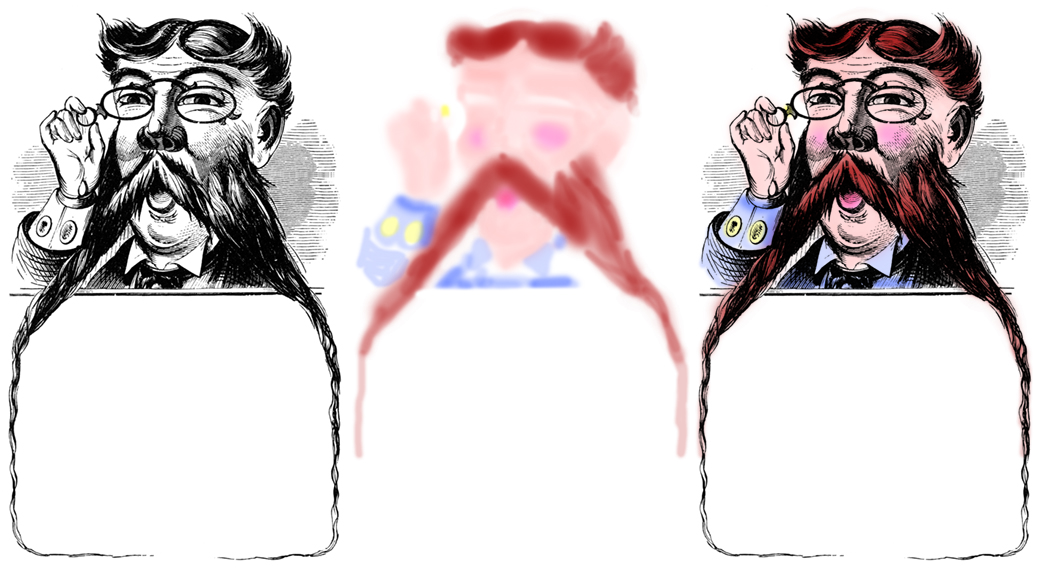
On the left is the scan, in the middle is the color Layer (no black) which is created in Multiply Mode. On the right is the composite of the two layers.
Then I create a new Layer, and define that layer to be in Multiply Mode. This is the layer on which I put the color. I paint with the brush tool mostly, setting the Opacity of the brush (in the title bar) to about 20%. This makes it possible to paint in small increments over the black image, building the color gradually and very nicely.
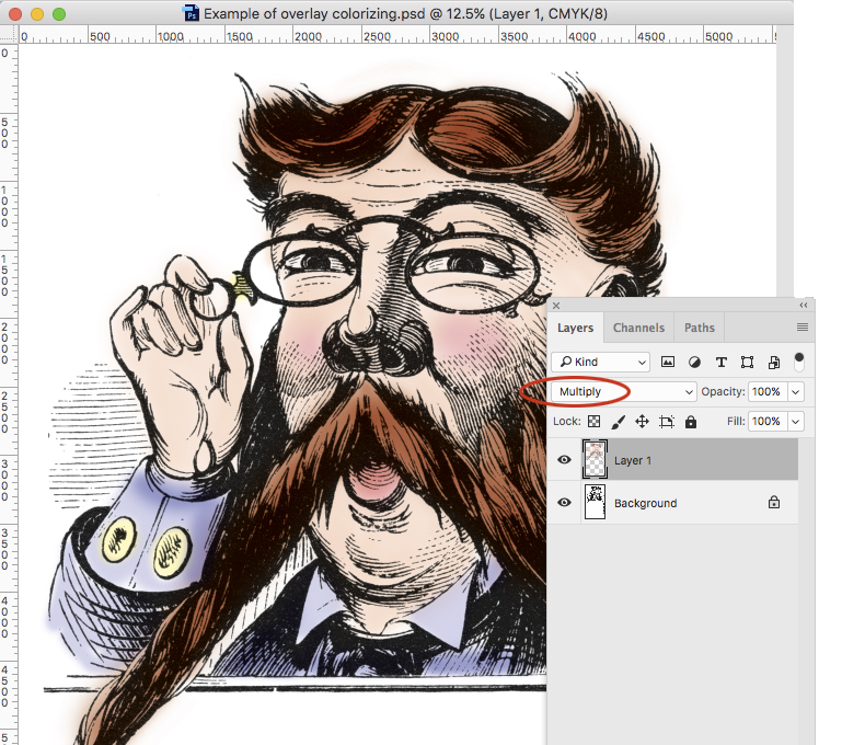
In Adobe Photoshop: this shows Layer 1 (containing all the color) superimposed on the Background (containing the black line art). I have ellipsed (that’s like encircling) the Multiply Mode to show where it’s located.
The quality of the painting is delightful. It looks like art from another century, and in part – it is!
The final photo-illustration exists as two Photoshop Layers – one for the color, and one for the black. If I save the file as a PSD or TIFF file, it will reproduce nicely on the Konica-Minolta machine, making very convincing line art and color.By changing the Mode of the color Layer, I am in effect printing all the color in overprint mode. This eliminates any problems with register or fit, making the printing easy.